←Back to Insites


10 Common Mistakes Financial Advisors Make On Their Websites
Published: Nov 2, 2023
Read: 6 min
Look out! Are you making any of these common mistakes?
A wealth management firm's website is a powerful tool for building trust and attracting prospects. However, it's essential to avoid common pitfalls that can undermine your online credibility. This article explores ten common mistakes you may be making on your website and offers tips to fix them.
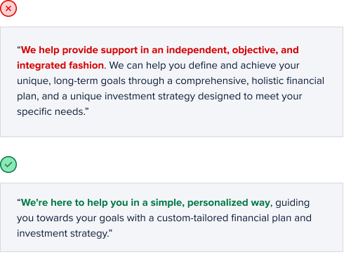
1. Verbose Language
Financial advisors often fill their websites with verbosity and industry jargon to appear professional. Using sophisticated language to impress visitors is tempting but usually has the opposite effect.
People who visit financial advisor websites are seeking simplicity and clarity. Complex language can be overwhelming, causing visitors to leave or assume that working with your firm will be overly complicated.
Verbose language can make a firm seem pretentious rather than professional. Using simple and direct language will help a firm appear professional and more approachable.
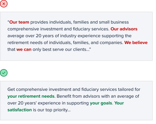
2. Self-Centered Focus
Another common mistake found on financial advisor websites is the tendency to make the website all about the firm itself rather than focusing on the visitors. This self-serving approach often results in an excessive emphasis on the company's story, mission, team bios, and awards while failing to provide content that speaks to clients.
While firm history, bios, and accolades are important to share, it becomes problematic when it overshadows customer-centric content. The visitor, who may have pressing financial questions or concerns, is instead met with a barrage of content that feels salesy and self-promotional rather than welcoming.
The Fix
Review and rewrite your website content with a focus on your visitors. Provide content that answers your visitors' questions and resonates with their needs. Use the Ctrl/Cmd+F function to find "we" and replace it with "you", rewriting your content as necessary.
3. Outdated Content
Neglecting to keep website content updated is a common mistake with serious repercussions. This issue often extends beyond the website to a firm's social media, leaving a trail of digital neglect that can erode trust and suggest a lack of attention to detail.
An outdated website can give the impression that a firm is not actively engaged with clients or the financial world. Visitors may question the firm's reliability when they find stale content, whether outdated news, events, or blog posts. They might wonder if the firm is still in business or genuinely interested in providing current, valuable services.
The Fix
Schedule regular content updates. Keep your social media profiles active and current. Set a schedule to update content, blog posts, and news regularly. Updated content not only improves trust and engagement but also enhances your website's SEO.
4. Cliché Images
Cliché or overused images can make your website seem generic and uninspiring. They fail to distinguish you from the competition or convey your unique identity. These images can create a lackluster impression, making it hard for visitors to connect with your services on a personal and emotional level.
Using poor-quality images is also widespread on financial advisor websites. Images are often pixelated, stretched, or poorly cropped, which looks unprofessional in visitors' eyes.
In an industry as personalized as financial advising, where trust and transparency are paramount, using high-quality, unique images is essential to building a solid rapport with your audience.
The Fix
Take the time to choose unique and realistic photos. Premium stock image providers like Shutterstock or iStock offer a wide range of photos to help you stand out from the uninspiring norm.
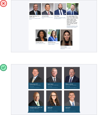
5. Sloppy Team Pages
In the quest to provide detailed information about their team, small businesses often create mismatched team pages with lengthy team bios. This can significantly hurt the firm's professionalism.
While sharing information about your team members is crucial for building trust and showcasing your firm's expertise, it becomes problematic when the visual presentation is sloppy, with long-winded bios. Mismatched team photos, varying in quality or style, can create an unprofessional impression. Lengthy team bios can seem self-centered and make it difficult for visitors to sort through information quickly.
Inconsistent team images can suggest a lack of unity and cohesion within your firm, essential for instilling confidence in your clients. An unprofessional team presentation can cast doubt on your firm's level of expertise and competence.
The Fix
Use consistent team photos on your team page, and keep the bios short. Consider hiring a professional photographer. At the very least, use decent-quality photos and organize the page well. Never leave headshots blank or 'coming soon.'
6. Cluttered Layouts
A website's design or layout plays a pivotal role in user experience. Yet, many financial advisor websites offer sub par layouts, poor mobile optimization, and a cluttered experience.
A poorly designed layout can leave visitors frustrated and discouraged, resulting in visitor abandonment. A cluttered look doesn't just detract from the visual appeal of a website; it can suggest the firm itself is disorganized and unprofessional.
Visitors expect an easy, intuitive experience when navigating a financial advisor's website. A poor layout can hinder their ability to find the information they need and erode their confidence in your ability to deliver professional services.
The Fix
Invest in professional web design services. A professionally-built website can involve time and money up front, but it's an investment that will pay for itself many times over, especially for high-value services like wealth management.
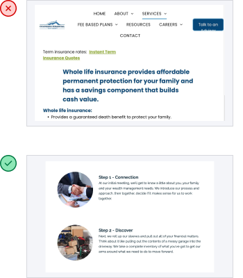
7. Poor Graphics
Financial advisors often include unprofessional design elements in their websites, like clunky icons and poorly designed infographics. These elements diminish the overall professionalism and credibility of the website and the firm.
Poorly designed infographics - usually created to represent a firm's "comprehensive services" or "unique approach" often end up looking amateurish and confusing.
For visitors seeking a trusted financial advisor, a professional and cohesive website design is a critical factor in their decision-making process. Unprofessional design elements can cast doubt on your competence and attention to detail, driving potential clients away.
The Fix
Let a professional designer create your graphics. They will ensure that your elements adhere to a consistent style and quality standard. A well-designed, cohesive appearance enhances the trustworthiness of your site and instills confidence in your firm.
8. Technical Errors
Common errors include broken links, misspellings, and accessibility. Broken links are frustrating and suggest the firm doesn't care about the visitor's experience. Misspellings scream a lack of attention to detail, and accessibility issues can make elements challenging to read. They could also lead to legal problems related to ADA compliance.
These issues can feel minor, but they erode trust in a firm. Attention to detail is critical to potential clients, as they expect precision when dealing with financial matters.
A website with errors gives the impression of neglect and indifference, sending visitors looking elsewhere.
The Fix
Use free, easy online tools to find and correct these common issues. Use the Ninja Online Spell Check Tool to check for misspellings. Use the Dead Link Checker to check for broken links. Use WAVE to check for accessibility issues.
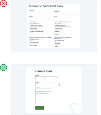
9. User Hurdles
Complex, non-user-friendly elements on a financial advisor's website, like hard-to-fill-out forms, challenging navigation, and confusing tabs can create a frustrating experience for visitors.
Difficult-to-use features can discourage engagement with your content and services. When forms are cumbersome or broken, potential clients may abandon their attempts to contact you or access valuable resources. Confusing navigation can leave visitors feeling lost and overwhelmed, pushing them toward competitors with more intuitive websites.
In a field as competitive as financial advising, your website must offer a seamless and user-friendly experience to build trust and attract clients.
The Fix
Hire a professional web design firm and let them make the design decisions. Making your website more user-friendly not only enhances your professionalism but ensures you're giving potential clients an easy path to contacting you.
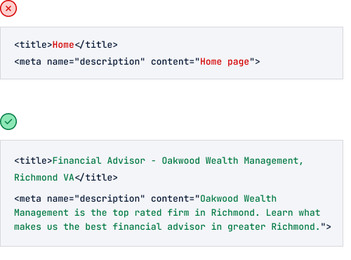
10. Missed SEO Wins
Many small businesses miss easy SEO wins. Neglecting straightforward opportunities to enhance your Google rankings can be costly.
Failing to use relevant keywords in your title tags lowers your Google rankings. Not incorporating keywords into your content can hurt your website rank in search results, making it less visible to potential clients. Missing these easy SEO wins can lead to missed opportunities and lost revenue.
Optimizing your website for Google search is a vital part of driving new business to your wealth management firm.
The Fix
Use relevant keywords in your content and optimize your title tags. Use the To The Web Title Tag Checker to check your title tags. Hire a professional firm to handle your SEO and optimize your website to ensure you appear for important Google searches.
Conclusion
Before going down the DIY route with your website, consider the significant advantages of hiring a web professional to build and maintain your web presence. They'll steer you toward success, save you from costly mistakes, and ensure your business shines brightly.
Let’s talk about your website!
You’ll get real answers and an honest quote. No jargon, no pressure, just clarity.
Get A Quote